Description:
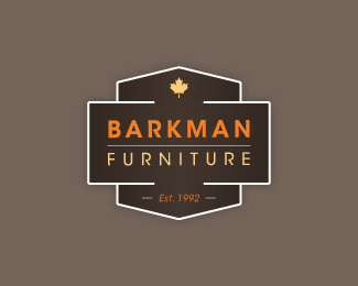
Another swing at my current project. This is more of a structured, shield type of logo. Prospective colors may be orange and brown.
Status:
Work in progress
Viewed:
4402
Share:



Lets Discuss
Softened the corners just a touch. Thanks Mike and Same for the floats!
ReplyI like this but I think the white boarder is a little bright. What about that orange or yellow color instead?
ReplyI see what you mean and I had tried the other colors but it seemed like a bit of a yellow/orange overload. For now I think I'm happy with the white but I'll definitely keep tweaking to see if find a solution other than white.**Thanks for your input. Means a lot!
ReplyThere's also an option of ditching the white and doing the cuts on the places where it enters the enclosure...
ReplyI tried that as well but it gives it somewhat of an up and down arrow effect. Thanks for the feedback, though. I am going to keep working with these suggestions, and I'll let you know if I come up with any suitable updates!
ReplyPlease login/signup to make a comment, registration is easy