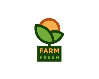
Farm Fresh
by megashred13 • Uploaded: May. 19 '11 - Gallerized: May. '11

Float
(Floaters:
72 )
Description:
Unused proposal for Farm Fresh. Mark has a bit of a double meaning (for lack of a better word) and can be seen as the cliche sunrise over the hills and/or a fresh new plant in bloom.
Status:
Unused proposal
Viewed:
29545
Share:

Lets Discuss
Thanks for the float Mike! Version 2 can be seen here: http://logopond.com/gallery/detail/137493
ReplyJordan, like them both. I think this one has a better balance to it.
ReplyI agree with you. I did the second version to advance the feeling of something growing. I may tweak it to try to get it to present a bit better...
ReplyI really love this.. Did you try one scaling the %22Farm%22 up until it's justified with the %22fresh%22... I dunno, maybe scaling it isn't the answer.. But I feel like farm is just asking to be the same width as fresh so it creates more of a box.. either way excellent logo!
ReplyOh wow! My first gallery entry!!! Thank you to whoever added me! This is a cool way to start the weekend....**@Danny - Good suggestion. The type is still the weakest part of this design and could probably use some adjusting. Thanks for your input!
ReplyI've updated the type. Justified Farm and Fresh and updated the color of Fresh to green. Good update or did I just take it the other way?
ReplySolid, high-contrast and easy to see at a distance. Winner!**Maybe round the corners of the green box just a smidge to soften it up? Perhaps only the two bottom corners of the green box? Just my 2c.
ReplyThanks Herb! I tried your suggestion and for now i think I like it without the rounded corners, somehow it just seemed slightly distracting. Thanks for the input though, I'll take all I can get!
ReplyBold %26 fresh!
ReplyMe likes better other version of this logo
ReplyIt might be worth trying to enlarge the leaf/sun part just a bit, so that it pops out of the text rectangle like it is growing. I think that is what I like about the other one, so it might be a way to combine them. Nice work on the text, this is very nice and memorable overall!
ReplyThis really stands out of the front page due to its simplicity, really well resolved it all aspects.
ReplyThanks guys! @Lumavine - Good idea - I may give that a try!
ReplyThis is really Fresh
ReplyThanks Mike! :D
ReplyPerfect!!!
Replylike!
Replythanks guys!
ReplyThis work really nicely. Well done!
ReplyLooks really good man :) Nice use.
Replyso fresh %26 so clean
Replyhttp://www.youtube.com/watch?v%3DIADdGzHreFQ
ReplyOne of the healthiest logos I have ever seen:)*@Chad, that's a good tune:)
ReplyCoolio.
ReplyThanks guys!!
ReplyThis is very cool. The other thing the circle reminded me of was an orange (the fruit) hiding behind the leaves. I love it
Reply@DanF - Thank you!
ReplyA great idea of the logo and realization of conception!
Replyhttps://www.facebook.com/GMOFreeUSA This reminds me of yours. Just FYI.
ReplyVery similar: http://farmillinois.org/
Replyeeek
@ClimaxDesigns yes down to the word Farm inside the icon frame in bold sans serif. Sad
Reply@ClimaxDesigns @LumaVine So I sent them several messages without response and when they finally did respond they denied ever having seen my logo (as well as saying they see no similarities in the design, seriously), claimed the designer who "created" the brand had never seen my logo, and went as far as having their lawyer issue a statement saying I had no argument. So I'm kind of at a loss as to what, if anything, I could even do about it at this point.
ReplyAgree with David. Take option 2 mate. IP legal battles takes a long time to resolve and the courts would not touch you until you have gone through private mediations. If you are not suffering a great financial loss with this infringement then move on. Its just not worth it.
ReplyPlease login/signup to make a comment, registration is easy