Float
(Floaters:
56 )
Description:
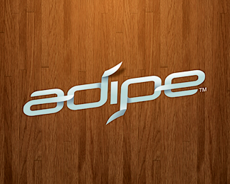
ADIP ei ambigram based text logo with the popular folding trend style
Status:
Unused proposal
Viewed:
20551
Share:



Lets Discuss
Not digging the wooded background! :)
ReplyI liked this the first time I saw it months ago, now I just looked it up to see it again and I see it only has one not so great comment. That's too bad - I think you did a great job. An ambigram, it looks really slick, great shading, would work in any print situation and works great on screen, etc. Good one!
Replyalways a fan of ambigrams - nice. Your name sounds familiar
ReplyLove it! :)
Replyseriously cool!
Replygreat ambigram.
ReplyCool work!!
Reply%5E agree with all, nice work :)
Replythis is really a nice job.
Replyi just love it.
Replywhat does adipe mean/stand for?
ReplyReally nice typography and the folding style looks great too. Excellent logo.
ReplyLove how it looks on the background. And it spells the same upside down. Excellent work!
ReplyVery clean and clever design, love it. The ribbon effect was executed with some definite mastery.
ReplyVery nice work..
ReplyGorgeous execution! The lighting is perfect.
Replyrealy nice job %26 shadow
Replyvery nice shadow i like it
ReplyVery nice!
ReplyReally nice work!! Well done friend.:)
Replyniccccccccccccce
Replymany thanks for comments friends,... i really appreciate it:)
ReplyPlease login/signup to make a comment, registration is easy