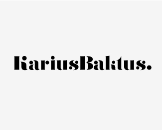
Description:
KariusBaktus is my Visual Journal.
The blog is about graphic design, typography, fashion, lettering, photography and music. In other words, the things I love.
As seen on:
kariusbaktus.com
Status:
Nothing set
Viewed:
4199
Share:
Lets Discuss
Beautiful type work as always Mads :) My only crit would be that the lowercase K initially struck my as an l %26 i reading 'Balitus'.
ReplyAgreed, looks really nice, its only the K I'm having a little trouble with.
ReplyThanks a bunch guys. I expected some comments on that, cuz I've really been struggling with the lowercase /k/.
Replycool, cool...maybe have a little bit of stem attached to the circle shape you've got for the K (so it almost looks like a comma/quotation mark) might tie-in with the k's upright better.
ReplyJosh, that might do the trick. I'll give it a shot. Thanks for the constructive feedback my friend.
ReplyNice type treatment Mads!
ReplyAnother masterpiece! Vil du have noget imod at besvare nogle f%E5 sp%F8rgsm%E5l om uddannelse indenfor design, hvis jeg sender dig en mail i l%F8bet af ugen?
ReplyThanks Chris and Alex!
ReplyOg selvf%F8lgelig Alexander. Send mig endelig en mail.
ReplyVery nice! I read it correctly right away. I don't think the lowercase %22k%22 is an issue.
ReplyCheers Julian.
ReplyThanks tony!
ReplyI keep coming back to this. Lovely piece!
ReplyJulian, I really appreciate it.
ReplyMissed this one...sweet work sir.
ReplySpanks Joe!
Reply!
ReplyAbsolutely beautiful!
ReplyI'm thrilled. Thank you sokol and Saawan.
ReplyPlease login/signup to make a comment, registration is easy