
Description:
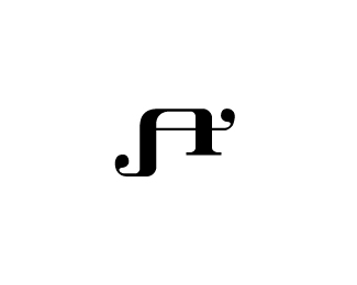
Ambigram made for Awesome Industries. Still wip.
As seen on:
mabu.dk
Status:
Nothing set
Viewed:
19627
Share:
Lets Discuss
Looks really good. The only thing that's bothering me is the middle 'e' and 'o'. I think they can be a little more pronounced and still be legible. What do you think?
ReplyRead it right away! Very nice!
Replythis must be some awesome industries.
Replyawesome!
ReplyClever stuff man, really good.
Replyjust awesome :)
ReplySorry, but this looks terribly forced. I see nothing gained using an ambigram when the font looks so sub-par.
ReplyI disagree with barry, I think it is nearly done and i instantly read 'awesome'
ReplyI read it easily as well.
ReplyI%B4m not saying it%B4s not readable. But simply rotating the a and w, there are hundreds of better options for a font, like this one: %22awesome%22
ReplyBut it's an ambigram. The letters have to be rotated.
ReplyAh well. Quite simply: I don%B4t like the font, because the choice doesn't make sense to me, it looks far too old fashioned. Of course, I could be mistaken and Awesome Industries needs one. I automatically associate the font with punk / Motorhead T-shirts.
Reply%5E WOW how long you been designing? This is GREAT!
ReplyWow, thank you so much guys!
Replybarryconvex: No offence, but your arguments doesn't really hold. It's a individual discussion whether **you** like the typeface or not - the client picked it out themself. Like logoboom told you, the whole point of ambigrams, is that the letters have to be rotated, in order to be read from both ways.**I also wrote in the description, that the project is work in progress - so it still needs some tlc.
Replynice work mabu!
Replywell.. this is awesome!
Replyoooh... so awesome! nicely done!
ReplyBeautiful result congrats!
Replywow
ReplyAnother great work from you man!
Replygreat ambigram! my only complaint would be that there is NOTHING special about the 'industries' text -- gotta compliment the font somehow!
ReplyGenius! @brandclay - I disagree. If you mess around with the non-important text, it takes away from the main part of the logo, which is in the name 'awesome.' 'industries' MUST be nothing special so all the attention gets put on 'awesome'.
ReplyThanks for the comments guys. It really means a lot to me.
ReplyWow! How did I miss this one. Great ambigram Mads.
ReplyThe more I see this the more I want the TShirt!
Replyi just love ambigrams.
ReplyYep, good stuff.
ReplyGreat Ambi!
Replygood one
Replyi love ambigrams
ReplyYou guys are to kind. Thanks!
ReplyOr too.
Replylike andreiu says, awsome!!
ReplyCan I float this again Mads? Always loved it.
ReplyThat is great to conceive that all on your own. As a love of ambigrams I know the time, dedication and mastery involved in constructing one that works - congratulations!**On a side note, have you seen this?** https://www.wowtattoos.com/tattoos/designs/ambigrams/View-All/Awesome-style-L-ambigram-tattoo-design.html
ReplyMuy apreciado amigos.**@raja: Thanks a bunch mate. You are absolutely right. Ambigrams can be a tough nut to crack and the identity for Awesome Ind. was no exception. Hadn't seen something similar until now, thanks for letting me know.
Replyno problemo - that's why we are here
ReplyNice mate!
ReplyMate, your typography is insane!! Beautiful work.
ReplyI'm thrilled. Thank you gents!
ReplyAwesome
Replyindeed it is awesome!
ReplyPlease login/signup to make a comment, registration is easy