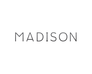
Description:
Been having sort of a terrible week. Don't want to get too personal, but my client work has suffered immensely from it and I needed to take the edge off. I have always liked this style of M so I made a few other glyphs around it to form my city's name for fun. S is a tough one. Pretty simple type overall, but that's usually my favorite kind.
As seen on:
Logo Design Wisconsin
Status:
Just for fun
Viewed:
1549
Share:


Lets Discuss
Horizontal elements of letter %22I%22 not supported by the other letters. And something with %22N%22. horizontal element of letter %22A%22 maybe duplicate from mid of letter %22M%22?
ReplyI really get tired of hearing about the horizontal elements in I's especially when it's in the center of the type. Wow. The average person would get so distracted by it that their head would probably explode wouldn't it? I didn't do the this for anyone but me and this is what I like and I'm pretty sure I mentioned that in the description. Really not trying to blow anyone else away.
Replyhorizontal, horizontal, horizontal, horizontal,...**%3Bp
ReplyWell now you've done it %3B) haha
ReplyPlease login/signup to make a comment, registration is easy