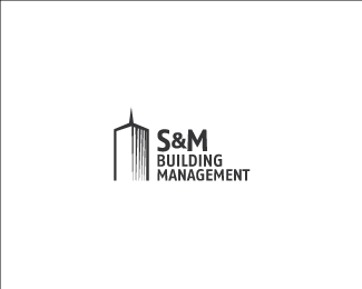
S+M
by lundeja • Uploaded: Jun. 22 '09

Float
(Floaters:
17 )
Description:
Building Management company in Chi-town. WIP for sheezy.
As seen on:
Logo Design Wisconsin
Status:
Unused proposal
Viewed:
2569
Share:


Lets Discuss
nice one. especially like how the middle leg of the M decends a little.
ReplyI wonder who's idea that was.
ReplyThis is masterful.
ReplyThanks, fatalis. I'm hoping the client thinks so!
ReplyHe better.
Reply*REJECTED*
Replydamn ....clients are almost assholes :(
ReplyHey! Very nice work Jared...I can't believe they rejected this...%0D*Anyway, chin up :)
ReplyThis is great! Sucks about the rejection, though I can safely say that almost ALL of us feel your pain.
ReplyYeah it's too bad, I always thought of this one as being the strongest. Hoping I get to revisit this general idea in the future.
ReplyI agree this is the strongest idea. The client just has to play it safe - which sucks.
ReplyPlease login/signup to make a comment, registration is easy