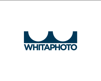
whitaphoto v3
by lundeja • Uploaded: Feb. 21 '09

Float
(Floaters:
0 )
Description:
Logo design for whitaphoto. He mainly does photoshoots for skateboarders so I tried to incorporate that into the design.
As seen on:
whitaphoto.com
Status:
Client work
Viewed:
1546
Share:


Lets Discuss
I think this is a stronger option than the other one. 'W' could use a bit more stylization, i.e. flatten the vertical part of the strokes and make it look like the shape from the v2. And then the W could work both as a standalone mark as well as a leading letter of a wordmark (which is what you already have here).
ReplyPlease login/signup to make a comment, registration is easy