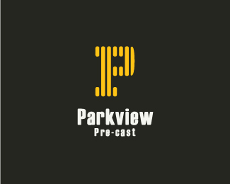
Parkview Pre-cast Concept 2
by lumo • Uploaded: Sep. 30 '10

Float
(Floaters:
4 )
Description:
2 Lined Version wip...
Status:
Work in progress
Viewed:
4205
Share:


Lets Discuss
Not sure I care for the skewed type, but the mark is kind of neat. I see a P and V, if that was intentional...
ReplyYep joe it was - thanks. I'll see about the type.
Replywell, it's much better now, imo. the tagline fits better too.
ReplyI was wondering about the tagline. It's too wide for taking it all the way across. **Overall, I'm liking it better now too as has more of a concrete or solid feel to it. Feel it fits the industry better as it stands now.
ReplyWhat if you made the tagline a little bigger and nuzzled the mark to the bottom right of the type...does that make sense? Not sure if that would look good or not.
Replyupdated mark. thanks joe.
ReplyPlease login/signup to make a comment, registration is easy