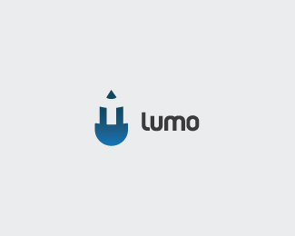
Description:
I’m planning on updating my logo. Concepts that I incorporated are an LED light and a pencil. LED symbolizes light or an idea and the pencil is design. Tried to incorporate both into one. I'd love feedback on this.
Status:
Nothing set
Viewed:
3446
Share:

Lets Discuss
Sweet mark James!
ReplyHey Lovely one... simple and effective...!!
ReplyI'm with Anthony. The designer/pencil combo needs to go the way of the pen nub and wacky household item/animal combos. I think you should explore different directions and find something truly unique.
ReplyNo offense taken Anthony. I have seen some pencil marks around, but thought I'd post and get backfeed on the idea. I like it as is but you do have a point about the pencil. I do love the LED concept though....
Replyi cant c the led concept at all...ye, pencil, loud and clear.
ReplyLED is on the bottom with the two prongs going up to form part of the pencil.
Replywhy not emphasize on the led, work something around it. it really seems appropriate for the name %22lumo%22
ReplyI'm thinking... I'm thinking... That's kind of where I began this one focusing on the LED. Even have a couple somewhat fine tuned. I guess this concept popped out and I loved the mark so why not post to get opinions. Plenty on here! haha.
Reply%5Eyess thats why we luv pond.. BTW nice mark.. but yeah looks more pencil than led..
ReplyPlease login/signup to make a comment, registration is easy