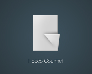
Float
(Floaters:
4 )
Description:
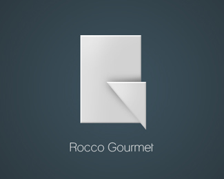
A different version of the logo.
Status:
Nothing set
Viewed:
1063
Share:



Lets Discuss
i think i prefer the other one. the object doesnt seem 'real' because of the disappearing shadow in this one.**i think in both you need to take a look at your light source and the shadow it would cast. if the light was from the bottom, the shadow on the bottom left of the triangle would be gone, if it was from the bottom right, then the top left point of the triangle isn't casting a shadow at all (which it would be).
Replyimo this one is better.
ReplyPlease login/signup to make a comment, registration is easy