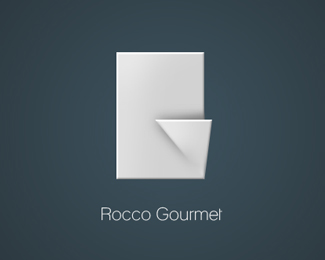
Rocco Gourmet
by lolec • Uploaded: Jan. 23 '09

Float
(Floaters:
2 )
Description:
Updated with slight modifications.
Status:
Nothing set
Viewed:
1173
Share:
Lets Discuss
I don't see any differences to the one that you posted before... Not even when I overlay them in PS...?! :-)
Replyjust a bit of work in the shadow, so the G is easier to see. Im uploading another one with a major change, looking forward for your feedback.
Replylol - i didnt see the G until you mentioned it. I'll check the other one too.
Replyi thought it was going to be for an origami store.
Replywell, its suposed to be a napkin, some people see the G imediatly, the mayority see the R and very few see both :S i hope yoy find the other easier to undersand.
ReplyDont think so, its a fairly unknown restaurant.
ReplyI think the concept (of using a %22crisp%22 napkin to form the letters) is great. Neither version is perfect though IMO. They are both a bit too abstract and a bit too sterile looking because of that. I'd consider using more elaborate, origami-like and more explicit folding that you can in fact find in many high-end restaurants (while keeping current rendering approach).
ReplyPlease login/signup to make a comment, registration is easy