Description:
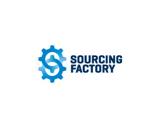
Sourcing Factory, a company that enables small to large companies and organizations to buy like procurement professionals: by creating a competitive market where suppliers compete for specific bids in a transparent and easy way that delivers the best value.
This identity will be published in Logolounge 6 and Logoliscious (formerly The Mini Book of Great Logos)
Status:
Client work
Viewed:
9021
Share:



Lets Discuss
This one... There might be a way to even pull out the S letter here but then again it might be too much! JMO...
ReplyYes, the %22s%22 is there, but needs more work. It'll be something close to this after all :)
ReplyAh, I just saw the S in the negative space. Very cool. I say leave it as it is. It's one of those sweet %22ah hah%22 moments.
ReplyI was actually looking at the %22S%22 made by the gears. If the darker areas where flipped, then a %22S%22 made by the gears is there. The %22S%22 in the negative space is sweet. AH HAH!
ReplyYou know what, you could cut out the top left portion of the bottom gear and the bottom right portion of the top gear to further reveal the S in the negative space. And I'm referring to the sections of the gears that fall on top of the negative space. Have you tried that? Does it make sense?
ReplyAh, you guys! Good feedback. It made me develop it further. A better looking %22s%22 i hope. And a hint of a %24 sign there too :)
ReplyNice update logoholik. Little thing I see, the type is not quite aligned left it seems.
Reply%5E good call. Fixed.
ReplyNice job on the update, bud.
ReplyYep, it works! You just had to put it in the 'second gear'! :)
ReplyThis is Fantastic!! how do I spot a good design? when I wish I've done it, great job.
ReplyI like where you're going with this. Unfortunately, I think the negative space 's' won't happen unless you make the whitish-blue gradient more white than blue. Then, you can't really see it as a pair of gears working together, can you? I recommend making the gears themselves into an 's' shape.%0D*%0D*If I were you -- and I'm not, so please regard this as only my perspective -- I would make the area where the two gears visually join more of a union, and make the whitish gradient on the gear itself help to fade the area where the 's' shape should not go. To help cut out the 's' shape, that is. %0D*%0D*Bottom-left (southwest) area of the bottom gear: white-blue gradient. Top-right (northeast) area of the top gear: white-blue gradient. Top left area of the bottom gear: darker blue, no gradient. Bottom left area of the top gear: no gradient. See where I'm going with this?%0D*%0D*Exceptionally long post. Hope you understand where I'm coming from on this. Take care, and good luck with it.
Reply%5B%5BIn other words, the gear shape should portray the 's' and not the negative space, imo.%5D%5D
ReplyI am satisfied with the last update. Eventually, will play with colors together with client if it gets green light at the end. Thank you again people! Cheers.
ReplyYou're welcome! So glad to help. Take care. :D
ReplyThe S is especially easy to see at a smaller size. I love this! Great job solving the puzzle.
ReplyVery effective! Great work as always Bojan :-) The S really stands out!
ReplyThat's sweet dude.
ReplyPersonally, I think an S shape made form gears wouldn't be nearly as effective. This is far more clever and memorable.
ReplyBrilliant!
ReplyVery nice Bojan :)
Replyamazing play with the colors...good job Bojan...as always %3B)
Replylogoholik, all your designs are great
ReplyHappy to hear something like that! I am not feeling the same tho, they can always be better :) but, again, it feels nice to hear such support from this wonderful community. Cheers!
Replynot bad at all Bojan %3B )
ReplyThe best!!
ReplyThis identity also found it's way to be published in Logoliscious! http://www.crescenthillbooks.com/submityourwork.shtml Cheers!
ReplyGratz B!
ReplyPlease login/signup to make a comment, registration is easy