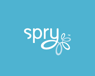
Description:
From client: Spry is a dynamic brainstorm of ideas. Spry offers companies ways to collaborate, ways to learn, ways to improve their business, ways to use technology to reach customers. Spry is about keeping business mobile and active and youthful, to promote the ideas of being nimble and to help change attitudes and feelings within the work environment.
Spry supplies technical solutions, provides marketing support, and helps connect clients with professionals and coaches to keep them on track and get them where they need to go. Spry is about being able to jump ahead, to leap into the future, and to be a catalyst of ideas and positive feelings that can bring support to small to medium-sized clients.
In short, Spry is a consultancy, a partner, an idea factory, and promotes an open mind.
As seen on:
spry
Status:
Client work
Viewed:
15108
Share:


Lets Discuss
this is the right color knocked out.
ReplyThanks Paul.
ReplyThis is a beautiful logo, I love the execution on the Y. However, I feel this is perhaps a little too feminine feeling and not business-ey enough for the service the client provides.
ReplyRyan, i've tried to represent active and youthful. Feminine feel is neutralized with rough transformation in typography. Color combos are still to be defined tho, hence it may help further differentiation. What is feminine while not business-ey enough anyway? Skype? Huge Inc? Cheers!
ReplyI really love this one, Bojan. Nice work :D
Replysimply beautiful
Replyi thought this was already in the gallery? its one of my logoholik fav's
ReplyYou sure know how to make the complex look simple. Awesome.
Reply%22Simply%22 fantastic Bojan!
Reply@Bojan, nice logo**@Paul Rand, I take offense that you're handle is the name of a well respected, %3Cem%3Edeceased%3C/em%3E graphic designer. Aren't you in effect posing as him? I'm not sure what purpose you have by using such a nameother than to pass yourself off as one of the greats of logo design?
Replymaybe his name *is* paul rand... maybe it doesn't matter... **there is a guy on here who goes by the name of jesus... !
Reply...ver nice Bojan... as usual... the identity specialist %3B)
ReplyEven tho you have a point in accomplishing %22one focus - clear message%22 rule this is one of the few situations where i decided to let typography interact with a symbol a bit more, even tho it seems to bring in a double focus. Elaborate explanation would be: typography treatment is meant to apply transformation from something raw, unfinished, through learning/brainstorming/improving and finally connecting to something more approachable, mobile, youthful - to leap into future :) %22s%22 is cut of like %22p%22 and %22r%22 - bottom stems sharp, leading to rounded ones and finally spiral at the end.
ReplyGood explaination, i was wondering too bout the cut 'S' it now figures...
ReplyHm..i must say calling himself %22paul rand%22 is obviously an homage...back to logo design: this brand is awesome. I think business is too uptight and could use a brand like this.
Replyalright, we'll chalk it up to just an homage, or maybe his name really is 'paul rand' as nido mentioned...like on office space where the guy's name is michael bolton, but i digress...again, nice one bojan.
ReplyWhat to say... thanks for kind words!
ReplyNice Idea Nice execution
ReplyOoh... I like this!
ReplyThanks %3B)
ReplyLawrence just showed me this: http://www.mycurli.com/ via twitter. I am shocked... waiting for response from my clients...
Replyoh no...if it is a rip, sorry man, this sucks**lovely logo
Reply%5E%5EYikes! :/ The design is great Bojan.
ReplyBojan, sorry to see that. You're officially the second most ripped person on the planet... after Raja.
ReplyHmm... no response from any party involved... strange... well, at the end, legally, it's not my problem anymore... I hope my client will resolve it if they wish... just feels strange
Replynice i like it %5E%5E
ReplyPlease login/signup to make a comment, registration is easy