Logopond monogram+wordmark
by logoholik • Uploaded: Jul. 04 '15


Float
(Floaters:
4 )
Description:
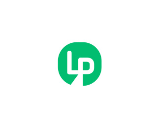
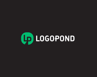
Had some random idea, needed to document it :) LP pondpad monogram icon and matching typography to steer away from illustration lillypath which i think should be avoided imho - somehow all lillypads give some cliparty feel to branding, too casual and perhaps dated? Not to mention almost everyone of them will hardly work the same in one color environment (tipical usage in mini social icons). For the record, Muamer's proposal still a favorite...
Status:
Just for fun
Viewed:
1473
Tags:
logopond
Share:


Lets Discuss
There's no stopping you now!
ReplyVery nice! But the first thing that comes in my mind is Vine. Try chaning the color to a darker green or dark-brown.
ReplyPlease login/signup to make a comment, registration is easy