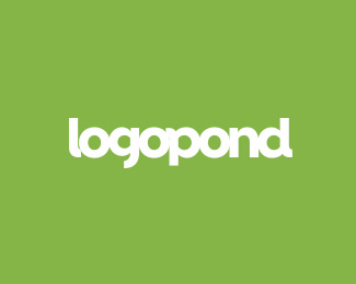
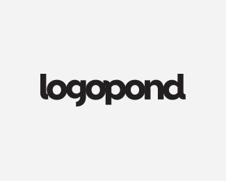
let's stick together wordmark approach :)
by logoholik • Uploaded: Jun. 02 '15
")


Float
(Floaters:
7 )
Description:
Logopond has such strong wordmark brand value gained over the years... maybe main logo doesn't need an icon at all? http://www.printmag.com/branding/when-to-wordmark-2/
Status:
Just for fun
Viewed:
1336
Tags:
logopond
Share:


Lets Discuss
This is my favorite, easily. The Icon, the color, and the type look great. My only complaint is that some of the letters appear to be touching, others do not. I would make that uniform. The 'l' specifically looks very weird. Also, I might play with making all the centers of the letters completely circular. Not sure how that would look, but just a thought.
ReplyPlease login/signup to make a comment, registration is easy