Description:
For a web portal / online magazine / community related to home decor & resources. Kindly advise & comment. Tks!
Status:
Nothing set
Viewed:
2401
Share:





Lets Discuss
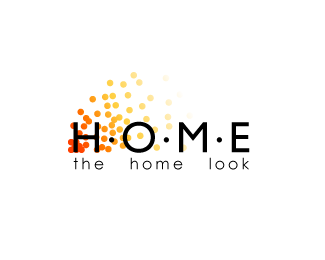
i like the effect created with the colored dots...*maybe try increasing their size and removing some of the extras to simplify the mark and make it look less cluttered.*i'd suggest you try getting rid of the black dots between the letter spaces (as they kinda compete with the colored ones). *i love the color palette, but you may want to lighten the red up a bit to create more contrast with the black type (although increasing the size of the dots and thus the amount of red may obtain the same effect...)*also, the wordspacing in the tagline seems kinda awkward (there's too much of it!)--try playing with the kerning to increase the letterspacing and reduce the space btw words. or actually, by removing the black dots, you can tighten up the entire mark horizontally, bringing the letters in HOME and the words in the tagline closer together.*just my 2 cents....*this is a great start, and i'm eager to see how it evolves! *
ReplyPlease login/signup to make a comment, registration is easy