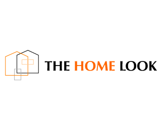
the home look #8
by ling • Uploaded: May. 28 '08

Float
(Floaters:
1 )
Description:
proposed logo for a home resource web portal.
Status:
Nothing set
Viewed:
1920
Share:
Lets Discuss
I like this one the best. The artwork seems big but I think this really clicks nicely.
ReplyTo me look 7 and 8 are the same logo with slightly different type treatments. If the type treatments were the same, you would have two variations for use in media that either required a horizontal logo or a more square logo. This gives your logo adaptability. I personally liked all the versions you have done for this client that I have seen so far. Good job.
ReplyPlease login/signup to make a comment, registration is easy