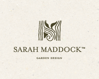
Manifest - Concept Two
by limeshot • Uploaded: Oct. 15 '10

Float
(Floaters:
17 )
Description:
Second concept for an executive coach in Sydney; she is teaching professionals to manage their professional and personal lives and find balance and poise. She hates the whole "work-life balance" cliche, but that's probably the best description of what she does, unless you describe it as a path to illumination - she'd kill me if she knew I said this, she doesn't take herself quite that seriously :)
She's a great person, and very grounded, with no happy-clappy nonsense about her. She counts freedom, nature, respect and growth among her core values and loves the intricate geometric and arabesque motifs of the Moghul art in India.
This concept is based on the arabesque designs and also forms the shape of an M. You can find the butterfly again - symbol for transformation and growth - hidden in the central decorative element.
As seen on:
Limeshot Logo Design Sydney
Status:
Work in progress
Viewed:
3730
Share:


Lets Discuss
Liking it, cute, well executed, but I think that the %22belly%22 of the letter %22M%22 is a bit too far away %22pushed down%22. I mean, it surely makes you think of an %22M%22 lettermark, especially after you read %22Manifest%22, but somehow it makes me feel like there's a tiny bit too much going down in the middle of the %22M%22 between the letter's stems.
ReplyYep, have like 5 versions with and without the lower part of the central element%3B however I find this is the most legible M, and the drop reaching down offsets the heaviness of the top. Otherwise, if I just keep the top element (the decoration) and don't allow it to come all the way down it makes the M very top-heavy.
ReplyI see a fox?
ReplyThat's funny, for the life of me I can't see the fox...
ReplyOK, small changes to get rid of the %22fox effect%22. Any better?
ReplyHow did you get rid of something you couldn't see limeshot :D?
ReplyWell it seems it was one element that was causing the problem (based on feedback)- which i removed. I still can't see the bloody fox though :)))
ReplyNice. I like it but don't know why, there's something off for me... Maybe the 2 bottom flourishes on M's legs... Have you try to put them %22outside%22 of the M mark? Just a thought.
ReplyPlease login/signup to make a comment, registration is easy