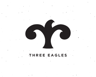
Float
(Floaters:
19 )
Description:
An evolving concept that I am working on atm.
Status:
Nothing set
Viewed:
3732
Share:



Lets Discuss
Simple and beautiful. Loving the negative space under the wings. Very nice!
ReplyThanks Robert :)
Reply%5E Great use of space. Would look great as a repeat pattern too :)
ReplyThanks Josh. I'll have to try out the pattern. Against my better judgement, I actually created both sides separately instead of reflecting them.
ReplyThis is beautiful, Sneh.
Reply%5EYes it is. Don't do the speckle craze though Sneh. %3B)
ReplyThanks Srdjan!**Thanks Roy :) Just the background, it looked too stark on white, but maybe that's a good thing.
ReplyNice work on Dribbble btw. Good to see what everyone's doing when they're not designing logos.
ReplyGreat again Sneh!
ReplyAm I correct in saying that the wings are made up of 3 parts in Clarendon? I like this (even if the answer is no).
Replyreal sweet, Sneh!
ReplyThanks Roy, Michael, Mikey!**Thanks Todd! Very Intuitive! But Belizio was my inspiration :)
ReplyThis is a really cool idea Sneh, but the curves could definitely use some love.
ReplyThnx Joe. I agree, I will be revisiting this one soon!
ReplyPlease login/signup to make a comment, registration is easy