Description:
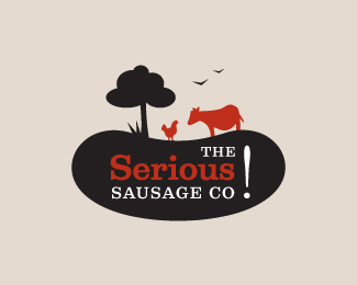
The final approved version for the The Serious Sausage Company logo. The UK company strives to offer seriously ethical meat products, mainly sausage to their consumers. They champion animal welfare on farms and wanted an earthy, organic feel that hinted at retro-ism.
Status:
Client work
Viewed:
11808
Share:
Lets Discuss
works well :)
ReplyThanks Josh :)
ReplyTop notch!
ReplySerious sausage, but a fun logo :)
ReplyReally cool logo. Nice colour combo to!
ReplyThanks everybody :)
ReplyI like everything apart from the '!'. I think it could do with being a bit heavier. Really liking this logo. I can imagine it on the product packaging etc. Great work :)
ReplyGuessing the %22.%22 that usually is at the end of %22CO%22 is the point of the exclamation mark. It's a little too far away, though, imo. Sorry to rain on the parade.
ReplyThanks guys .. that has been fixed now. Client is deciding between reversed out colors for the text and exclamation mark.
ReplyBrilliant... so many elements yet so clear and simple.
ReplyThanks jonnyd :)
ReplyI like this a lot. For some reason, the larger image is crashing when I open it. (Like, the one in this window.) it shows up fine in the smaller view on your overall showcase page, though.
ReplyThats weird .. it used to be there. I tried uploading it again with a different name and it says Image uploaded successfully but still won't show. If I delete and re-upload it, I lose the Floats right?
Replyyay .. managed to get it working again!
ReplyEpic sausage! I usually don't want to see the actual animal I am eating, but in this case I think it works.
ReplyThanks Luma!
ReplySneh, this is good work. One of your best.
ReplyThanks Mike! I appreciate that :-)
ReplyLove this logo :)
ReplyThanks Nikita :)
ReplyPlease login/signup to make a comment, registration is easy