Float
(Floaters:
5 )
Description:
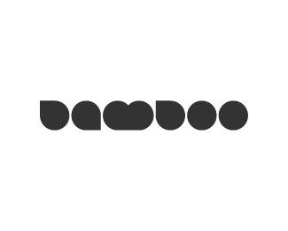
Concept logo for Bamboo Tablet
Status:
Student work
Viewed:
1630
Share:


Lets Discuss
I like this, but the B reads almost the same as an uppercase D to me which makes it say %22damdoo%22 in my head. Haha. I doubt there's a way to fix that and keep the simplicity of the geometry intact, though. Pretty cool nonetheless, it just might work better with a different word.*
ReplyI thought that bamboo is for something more then dots.
ReplyMilou - i understand what you mean - it is obvious that the design has nothing to do with %22bamboo%22 itself.**However, i wanted this simplicity in order to create a look and feel similar to the %22bamboo tablet%22 which made want to make this quirky logo.
ReplyOmg O.o - my first rip-off! :D
ReplyPlease login/signup to make a comment, registration is easy