Description:
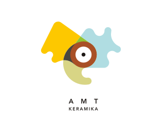
WIP. A logo for a studio that creates all kind of weaved accessories. In the logo you can see a weaved rose. Rose is a frequent decorative symbol.
As seen on:
Logotipu kurimas
Status:
Work in progress
Viewed:
11660
Tags:
flower
•
rose
Share:


Lets Discuss
The squarish top kind of bugs me because I see a face. "nosie rosie" I like the artistic flare of it though. Maybe make the top part more triangular like the other petals?
Replyhi, thanks for suggestion. definitely will work on it some more.
Replyalready in the gallery :) hehe, thanks. I was still looking forward to modify it. and I will do that :) It is still WIP.
ReplyUpdated version. Old version: http://www.efektyvusdizainas.lt/images/old.png
ReplyLove it, love it, love it
ReplyI think the updated version conveys petals better. Nice work
ReplyI still think to work some more with the line weights. At the moment waiting for the client approval. Thank you logomotive.
ReplyAnother update. Final version now.
Replyvery nice work, what font is used here pls?
ReplyThanks. The font is CK Higgins Handprint
ReplyI've said this a ton of times, so apologies if I sound like a broken record, but its something I pick up immediately when I see hand written style type. Tweak the letters that are doubled up so they're not identical to each other, even if its just marginally. This makes for a much more authentic hand written look, rather than a chosen font, which breaks that illusion that it's hand written. That little nit pick aside, I really like what you've done.
Replymuy bueno, no s� si v� la rosa de entrada, pero me hizo entrar, su portfolio es magn�fico
ReplyPlease login/signup to make a comment, registration is easy