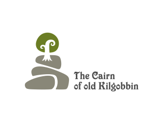
The Cairn of Old Kilgobbin
by kugelis • Uploaded: Jun. 08 '11

Float
(Floaters:
23 )
Description:
Logo for a farm. In the logo you can see a cairn which depicts the farm environment with hills and a tree.
As seen on:
Logotipu kurimas
Status:
Work in progress
Viewed:
5718
Share:


Lets Discuss
kinda dig the symbol, type not so much
ReplyGreat style. That symbol is just beautiful! Like Floris, I'm not a huge fan of the type. Although I do like the 'C' of 'Cairn' and 'g' of 'Kilgobbin' playing off the curves of your tree branches. Type perhaps needs to be simplified. Not sure if you have Goudy Sans Italic. It would keep the nod to heritage, but also add some modernism. There are a few different weights to experiment with.
ReplyI found it not that distracting as mates above, but I guess something smoother for this winner sign would be indeed better.
ReplyThank you guys. I'm also concerned about type. Simplification might be the solution...
ReplyAgree, mark is very nice, not happy with type:)
ReplySame for me, I really like the mark but I'm not a big fan of the type.
Replyque manejo de la forma y de lo amorfo
ReplyPlease login/signup to make a comment, registration is easy