Description:
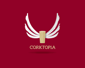
I tired to keep this logo light hearted by giving the logo a hand drawn look and feel. The idea behind this was that the cork was floating up into a 'utopian state'.
Status:
Unused proposal
Viewed:
5443
Share:
Lets Discuss
How does this work in black and white? Cool font, by the way.
Reply@ Ryan: Funny you mention the font, 'cause that is the one thing the client didn't like.**I never got to the stage of black %26 white, but I imagine it would've been OK, providing I stroked the wings or put a shadow behind them.
ReplyP.S - The logo was for a website, so I wasn't too concerned about black %26 white/reversibility options.
ReplyBrowsed through your folio again... Very nice execution on this one Marc... :)
ReplyI'm stoked you have taken multiple looks at my showcase. Much appreciated Alen :)
ReplyI found this at a search, looks very nice and original.
ReplyThanks tass :)
ReplyPlease login/signup to make a comment, registration is easy