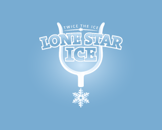
Description:
This is my first logo since I've joined that is in a development stage and needs critiquing. The logo is for a company that places self-service ice machines in various locations for public use.
As seen on:
Koodoz Design
Status:
Unused proposal
Viewed:
4570
Share:
Lets Discuss
Apart from going a tad darker, I don't really have much to advise here. Just one more thing, the curved text of 'Lone Star', put more curve in it but have the text vertically perpendicular (does that make sense?). But otherwise, this is top notch work and loving the cowboy heel-spike interpretation. Cheers.
ReplyI said the same thing as chan in the forum. However I did notice something else that might help it.**Loose the thin tiny tagline, it is not needed. Also you added depth with the bevel on the spur, however it is missing in the star, minus the fact that the star would be rotated 90 degrees to the right. :)
ReplyTiny tag line has to stay. Client request.**I will definitely look into the bevelling of the star. I was going to do it, but... got a little lazy.
Reply@ chanpion. Sorry mate, I didn't even realise you had commented. Pardon me :)**I think I know what you mean re the text being perpendicular, but have no idea how to do that, unless the only way is manually. Any tips using Illustrator?**Even if I create a type on path, the text will still rotate with the curve won't it?
ReplyWhen I first saw this, I thought of the Lone Star Beer logo because of the font and it's similarities.**http://www.lonestarbeer.com/Images/Header/HeaderSiteLSB.jpg**Maybe you should rethink the typeface?*
ReplyThanks for the feedback MrBaseball34, but this logo was only a proposed concept. It never went anywhere.
ReplyPlease login/signup to make a comment, registration is easy