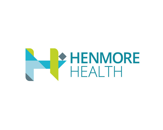
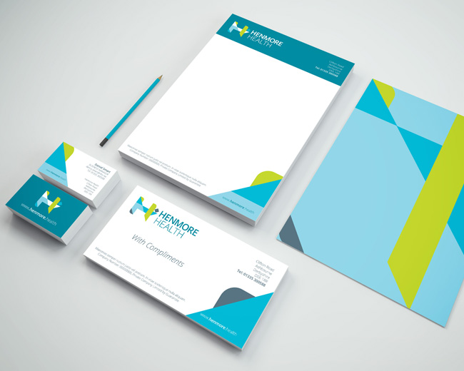
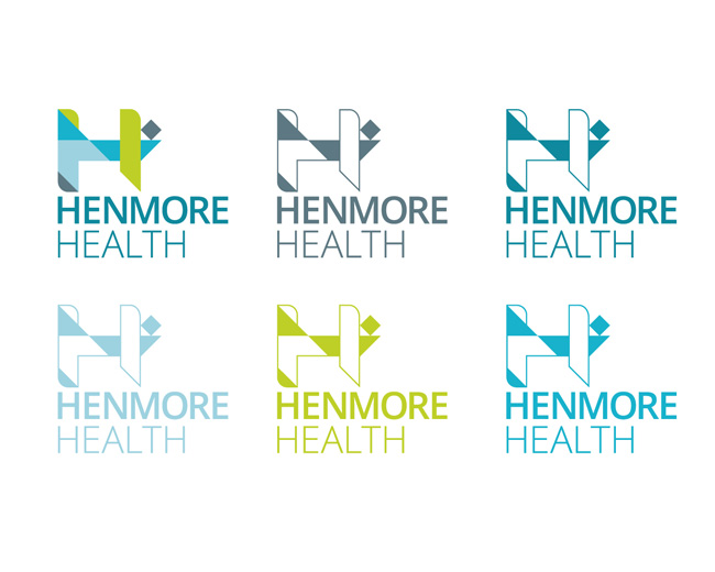
Henmore Health
by kieranharrod • Uploaded: Feb. 16 '17

Float
(Floaters:
0 )
Description:
Geographically inspired logo and branding for Henmore Health, a modern healthcare provider with a traditionally minded, caring outlook.
Forming a stylised H from geometric shapes, the design takes the geography of Ashbourne as its skeleton.
The bottom corner and right diamond are aligned with the locations of the Shrovetide “goals” beside the Henmore, with the river represented in blue between. A series of 3 blues highlight the river as the central inspiration for this design with accents of green for the land and a dark stone for the goals.
Henmore Health is owned and operated by the GP Partners & Practice Manager of a successful GP Practice in Ashbourne, Derbyshire, at the gateway to the Peak District.
Recognising the changing environment in General Practice and the pace of evolution, Henmore Health seeks to promote the Tiered Care Model for NHS Practices, evolve Primary Care Facilities to be more sustainable and robust in the current climate and provide Private Services to patients who seek a high-quality care pathway.
As seen on:
Henmore Health
Status:
Client work
Viewed:
1,243
Tags:
Healthcare
•
Shrovetide
•
H
•
River
Share:


Lets Discuss
Please login/signup to make a comment, registration is easy