Christ Church Derby
by kieranharrod • Uploaded: May. 22 '17

Description:
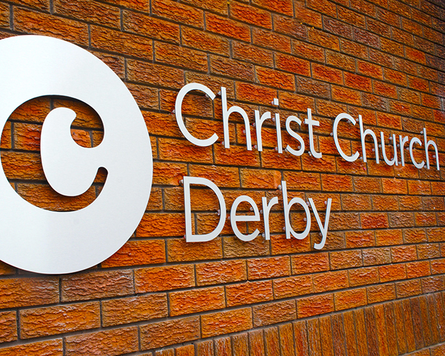
Eschewing typical religious imagery and derivative tropes, the Christ Church Derby logo design was been created to represent a congregation with a modern church outlook but with traditional (reformed, evangelical) doctrinal basis.
The circle represents God, an idea take with taken with this nod to history and tradition. In many traditional churches, symbology plays a massive role. Some of my favourite symbols found in old churches aren’t complex carvings or fancy golden alters, but the small things that often go unnoticed. Squares in churches represented man and circles God. Hexagons are used where God ‘meets’ man, often seen in the pulpit (where the Bible is expounded) and fonts (where people are baptised). If you’re interested, have a look at How to Read a Church by Professor Richard Taylor, this goes into all sorts of imagery and other stuff you’ll find in a church.
For the key letter, the C, I chose the characterful Century Schoolbook. This was set by Morris Fuller Benton in 1924. This had an extra relevance as Century Schoolbook is the epitome of a readable typeface, ideal for setting large blocks of text it, such as the Bible.
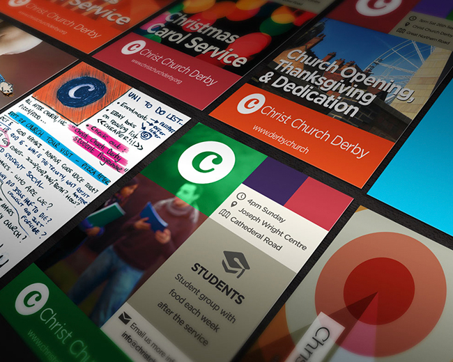
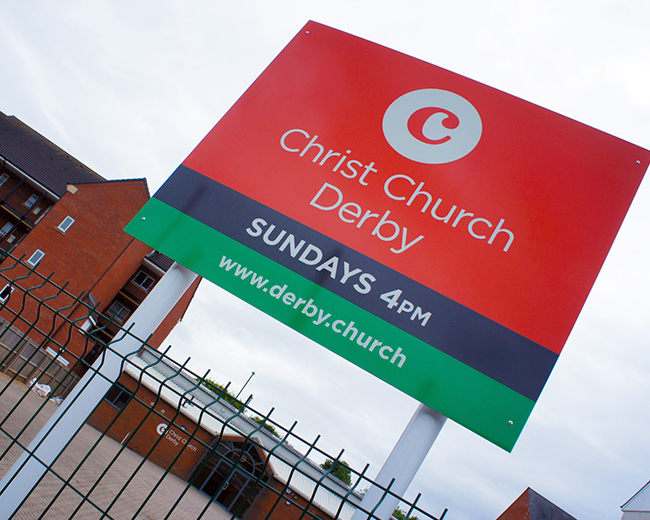
The remainder of the branding encompasses design for print, web & digital design as well as design for building signage. Material including flyers, leaflets, banners and posters in print, design for the web site http://derby.church, including the mobile responsive variation, power point presentations and raised lettering and mounted signs for the church itself.
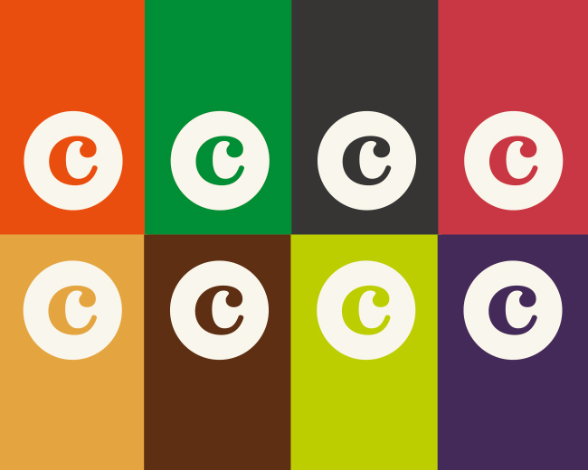
As well as the bold orange, the design scheme features a set of 8 colours, all bright and clear. These are used throughout the materials produced.
As seen on:
http://derby.graphics/church-logo-and-branding-for-christ-church-derby
Status:
Client work
Viewed:
765
Tags:
Modern
•
Tradition
•
God
•
Orange
Share:



Lets Discuss
Please login/signup to make a comment, registration is easy