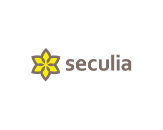
seculia ver.2
by kathariney • Uploaded: Mar. 20 '10

Float
(Floaters:
19 )
Description:
Second flower theme concept for a web coding company. Going for a less feminie/organic type of flower.
Appreciate any thoughts compare with this (1), that(3), or that(4) version.
Status:
Nothing set
Viewed:
4503
Share:


Lets Discuss
This is my favorite of the bunch Katharine! Type and mark fit very well together and the colors are great. Maybe have the type aligned from the 's' so that way it is evenly aligned with the flower between those two petals rather than aligned from the the entire type.
Reply@Joe, Thanks for the suggestion. I'll definitely try out what you said. i'm curious how that would look too.
Replyupdated. and i'm liking it better , thx joe.
Replythat's the best from the other three!
Reply@milo, thanks. interesting to see how other people react to it, cause this was my last bet %3B)
Replyagree with Joe and Milo. like this one the best. nice balance over all.
ReplyI'm seeing a Star of David. A number of petals aside, the mark looks generic and not exactly memorable. The type is really though, definitely the best between all options. Also FWIW I think the mark in that(3) has the most promise, but I would consider building S out of overlapping chained links rather than mixing dots and links together.
Reply@mikey, thanks. good to hear your thoughts. **@epsilon, I can see where you're coming from, and it could looks generic for some. *although chained links doesn't seems to work right off my head, I'll consider what you suggested when I heard back from the client. Also, I really appreciate your opinion. Thank you.
ReplyPlease login/signup to make a comment, registration is easy