Bang
by kassi • Uploaded: Jan. 01 '23

Float
(Floaters:
1 )
Description:
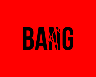
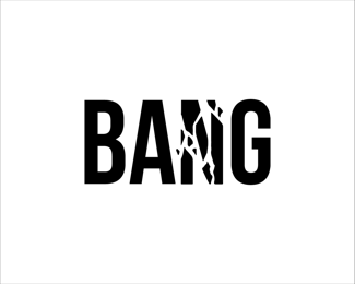
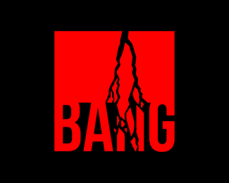
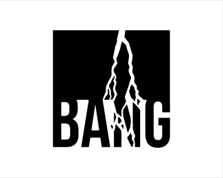
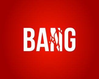
A logo that resembles a lighting bolt hitting solid rock. The equal-width sans-serif font symbolizes a hard and heavy object, not easily destructible. Two versions: one with the full-size bolt, and the other without it, which I actually like more. A good idea for a product that is a bit disruptive or even controversial, something that breaks conventions. If you like this type of logo and think if would suit your business, feel free to reach out :)
Status:
Just for fun
Viewed:
1168
Tags:
minimal
•
minimalism
•
simple
•
negative space
Share:
Lets Discuss
Well executed!
Reply@cajva Thank you! :)
ReplyPlease login/signup to make a comment, registration is easy