Description:
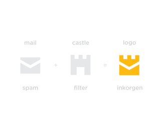
Recently I was asked to create an identity for a project called ‘Inkorgen’ which is the Swedish word for ‘Inbox’.
Company main features are: Email free from spam / virus • High availability cluster • No installation (Software as a service).
Inkorgen - We’re all about creating good and simple solutions against spam.
Status:
Client work
Viewed:
15370
Tags:
designer
•
logotype
•
clever
•
iconic
Share:

Lets Discuss
strong one ;)
ReplyThank you!
ReplyI didn't see it as a castle, but as a crown, but since you mention about Sweden perhaps that's why I imagined it as a crown, which I guess it's even better since from what I noticed many Swedish (and Scandinavian) branding projects incorporate a crown (perhaps as a sign of gratitude / recognition to their politics / history).
ReplyReally nice job, Paulius :)
ReplyAlex, thank's for your informative comment. Well, both crown and castle symbolise protection and authority, so I can agree with you that it's not a problem how people will recognise this brand mark.
ReplyAwe. Some.
ReplyThe force is strong with this one.
Please login/signup to make a comment, registration is easy