Description:
not sure if this has been used ... looks familiar but ... hope someone can help me out ... tia
Status:
Nothing set
Viewed:
2568
Share:


Lets Discuss
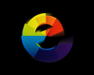
Whoeii nice effect very dynamic, active and a lot of depth but the first thing i thought off when i saw the logo was%3B %22Hey, Internet Explorer has a new logo%22.**Without any context its difficult to give it a place, damn you microsoft for brainwashing me.
Replyinteresting .. i thought ie but then thought maybe far enough away ... but further comments welcome .. thanks pendaco
ReplyKaimere... the only thing that is bothering me is on my calibrated monitor the lower right sections are very hard to see. Maybe lighten them up a tad.
Replymy monitor isn't calibrated, like fancy-pantsy Bart, but the dark blue seems a bit dark to me also.
ReplyLOL @ KGB!
ReplyI just super-calibrated. It's still too dark.
Replyhaving ... chucked the monitor out the window ... am revisiting thanks guys
Replyhere's a bizarre question ... something i was told the other day ... the american pantone systems is different to the pantone system in Europe .... now its not april so anyone can clarify ?
ReplyI made the following experience with Pantone: When I compared our chart and another one from another manufacturer, I found some tones pretty different between them. Solely in Germany!
ReplyWhat's the mark for? I like it a lot, it looks as if it's for a TV company just because it begs to be shown in full movement, the full color advantage and the black background.
ReplyI saw a logo very similar today on the bumper sticker of a truck. It was a %22G%22, did not manage to read the name.
Replydamn be good to know which g it belonged too**as for the mark ... itll find a home one day
ReplyPlease login/signup to make a comment, registration is easy