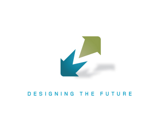
Description:
Just a test mark ... convinced it must have been done before but checking ... companys name begins with m
Status:
Nothing set
Viewed:
4013
Share:

Lets Discuss
Dude, that mark is beyond brilliant. I didn't even notice the 'M' at first - just the arrows. Love the shadow too. Almost wondering if the name would look better in grey? Even so, rocking job!
Reply'M' for Magnificent. One of your best ones Mike. Cheers bud.
ReplyI LOVE it. It also took me a little while to see the M but it's clear after a few seconds. It reminds me of how the FedEx logo has a hidden arrow that most people don't see. Great work. Very successful.*
Replyi think it%60s just the spacing between the letters that created that arrow by %22accident%22, I dont%60t think that is made there by will. btw nice mark there kaimere
Replylol hahahah ... cheers for the vote of confidence ... the arrows are intentional after looking at the forms, no accident just from sketches in my sketchbook ... im actually reeling from that comment ... my feelings are hurt hahahaha
ReplyI was talking about the FedEx logo, regarding of what dr_dimento said :)
ReplyThat is really nice - it's clean, and although as you said it seems familiar I can't recall seeing this treatment before
Replyheheh Sorry Bogdanv hehehe
Reply@ bogdanv - even so, I think the FedEx arrow was very well thought out. Typography is everything!! %3B)
Replynicely put ... and funnily an interview with the designer ... Mr Lindon Leader*http://www.thesneeze.com/mt-archives/000273.php
Replyvery nice kaimere... you are now officialy my 28th fave designer! congrats!!!
Replywooooo thanks Nido, im gonna break open the Moet....
Replygo easy on it %3B)
Replyill try Chandon just came round
ReplyPlease login/signup to make a comment, registration is easy