Description:
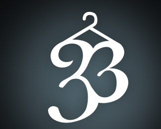
Logo design that is still in-progress for a dry cleaning and alteration company. Let me know what you think so far. The colors are based on the website that is in-progress also. Comments welcome, Thanks!
Status:
Nothing set
Viewed:
7132
Share:
Lets Discuss
I think i put too much emphasis on the heart.
ReplyI do like the revised heart image better - but now the %22point%22 within the heart/3 seems a bit too sharp in contrast to the larger 3.
ReplyI really like where you are trying to take this. In order to make this a cleaner typographical piece I would be inclined to have the lower edges of the heart follow natural the curve of the three, making the overall design more rounded.
Replyhave you tried to mirror the 3? With the right type you will get a heartshape. You will get symetry and hopefully a nice ornament out of this also. Maybe worth playing around with?????? On the other hand ...do you need the heart?
Replythanks for the comments, I will rethink the heart and definitely revise the shape of the smaller three. Thanks all for the comments.
ReplyI changed it based on some concepts. Decided to keep the heart. Hopefully more subtle now and now the smaller '3' is more similar to the larger, as the heart should be similar in style now.
ReplyI think your new revision is working much better.
ReplyYour almost there.The lower curve is a tad off.
ReplyI love this concept!
ReplyPlease login/signup to make a comment, registration is easy