by jpambrosi • Uploaded: Dec. 26 '08
Add to Pad (In 2 Pad s )
Description: real estate logo Status: Nothing set Viewed: 2424 Share:
I think the best type treatment was in http://logopond.com/gallery/detail/47615 and the best option for the mark is either this one or http://logopond.com/gallery/detail/48385. Also, I would consider pixelating latter mark, i.e. building the mark out of a 5x5 large grid of spaced squares.
Thanks man, you are helping me a lot...
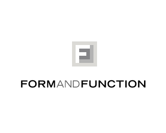
What do you think about this one epsilon?
I think there's no enough contrast between two darkest shades and I'm actually not sure about using four shades to begin with.**C'mon, fellas, where's your xmas spirit and all ? steer jose in a right direction already :-)
Please login/signup to make a comment, registration is easy
Follow


Lets Discuss
I think the best type treatment was in http://logopond.com/gallery/detail/47615 and the best option for the mark is either this one or http://logopond.com/gallery/detail/48385. Also, I would consider pixelating latter mark, i.e. building the mark out of a 5x5 large grid of spaced squares.
ReplyThanks man, you are helping me a lot...
ReplyWhat do you think about this one epsilon?
ReplyI think there's no enough contrast between two darkest shades and I'm actually not sure about using four shades to begin with.**C'mon, fellas, where's your xmas spirit and all ? steer jose in a right direction already :-)
ReplyPlease login/signup to make a comment, registration is easy