Description:
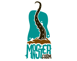
I just tweaked the original version of the logo and came out with this.
As seen on:
monster farm
Status:
Client work
Viewed:
8128
Share:

Lets Discuss
great style blake!
Replyhey birofunk! thanks you soo much for the kind words.
Replyfun design. like it.
Replyhey AnthonyLane and Mikeymike. So glad you guys digg! do you guys have twitter? that goes birofunk too!*
ReplyWow, I love that!
ReplyThe only problem is, I couldn't read it until I saw it bigger.
Replyi hear ya jerron. The tentacle is more of added bonus. The logo will be seen without it on all the materials.
Replythis is decal monster farm is actually putting on the door of the office.
ReplyPretty cool style.
ReplyI like the type, I just think there should be a little breathing room around the letters in monster, like with the graphic, how you have separated everything with a little white space.
Replyjerron. I will talk to my people (always wanted to say that) lol and see what I can do.
ReplyThen have your people get in touch with my people.
Replyhaha yess! that is the perfect response (jerron)
Replyamazing style.. fresh
Replythanks sjb
ReplyWow, scary %3B)
ReplyWow, this is really good!
ReplyNice stuff dude! Wonder why they're using a totally dif logo on their website?
ReplyPlease login/signup to make a comment, registration is easy