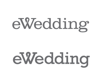
Float
(Floaters:
2 )
Description:
Looking for some feedback on this design direction.
Status:
Nothing set
Viewed:
2801
Share:

Lets Discuss
I like the top version. This makes for a nice type solution.
ReplyYeah, I agree...the top is the best. Looks good.
ReplyNo contest... First pick is better, lighter and more elegant.
ReplyNo brainer...top one. Nice!!
ReplyThanks for the feedback guys. I like the top one better as well. I've had some feedback that the loop in the W might read as an %22awareness ribbon%22, which is not really the intent. Any ideas?
ReplyInteresting idea! I'm going to play with making the W look more like a knot, or at least less like a ribbon, and then I might give that a go.
ReplyTop one is my favorite. I didn't catch the whole ribbon thing, I was thinking more of the %22tie the knot%22 thing.
ReplyI thought %22tie the knot%22 immediately as well. I'm not sure I agree with everyone though. I think that the ribbon feels best with the thicker typeface. The ribbon in the W on the top version seems a bit off balance. I have a feeling that the lighter contrast in the top typeface won't translate as well as the bottom face, as obvious a conclusion as that may be. The top face W seems to weigh so much more than the remaining lowercase letters.**I hate picking apart the top logo, I'm a big fan of the bottom logo.
Replyhey, funny I was asked to be the designer for ewedding.com last Jan but turned it down, wonder if its the same ewedding? Matt Kelly? Cool stuff though you def are css wp2 fashionable, just a bit too restricted maybe, dont hold back on the flare you have. Let your bullets fly, your one of the few designers that actually grasp the internet.
Replyah, matt venhuizen?
ReplyThe top one is the better of the two, but perhaps the first e, needs something, either a flourish, or slightly different treatment
ReplyPlease login/signup to make a comment, registration is easy