Description:
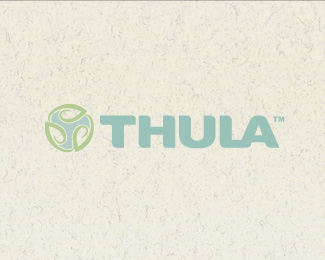
Chosen logo for a new company focusing on the creation of environmentally friendly, recyclable products using biodegradable components and materials. Using a leaf to portray movement in an unending loop, this idea is based on the basic principal of recycling.
As seen on:
http://www.thula.ca/
Status:
Client work
Viewed:
2430
Share:




Lets Discuss
very nice jenlogo :) great job
ReplyThanks very much Sean! Always nice to hear positive comments from talented, inspirational designers :) Cheers!
Replythe background is a bit much, kind of distracting. it would be easier to view your mark without it. %0D*%0D*I really like your mark, but your type seems a little too heavy.
ReplyPretty cool. I like the mark
ReplyThanks very much ahab!**Thanks for your view and comment gyui %3B)
ReplyI think the type is really nice but too heavy in comparison to the mark. That being said, the mark is nice too and the concept seems very strong.**May I ask what was the reason behind the united LA?
ReplyThanks Kode %3B) I originally had the mark larger and on top of the type, but the client wanted it to be less prominent so we went with the mark smaller and to the left and the %22T%22 inside screened back a bit. It actually works very well printed. As for the united LA, there was no major reason behind it other than the spacing of the letters simply looked better that way!*Thanks for your comment and float Kode :)
ReplyPlease login/signup to make a comment, registration is easy