Storrington Cricket Club
by jddesignsuk • Uploaded: Jan. 31 '22

Float
(Floaters:
0 )
Description:
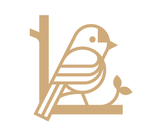
Storrington Cricket Club, based in West Sussex, UK, chose us to create a new logo with a fresh approach, whilst providing a nod to their existing logo and their long history. The club, nicknamed The Swans, wanted to engage more with the local community and welcome younger members to their Cygnets team.
We designed the logo incorporating the signature icon of a swan, whilst targeting the broad demographic, with a traditional, yet modern feel. The raised head promotes forward thinking towards the younger generation, along with the curved neck symbolising the ‘S’ in Storrington. The wide-spanning wings encourages the welcoming and inclusive nature of the club. The 19 visible feathers are a nod to the past, representing the 19 run victory in 1800 over a Sussex team. The swan icon, was developed using the golden ratio method.
As seen on:
JD Designs
Status:
Client work
Viewed:
554
Tags:
•
elegant
•
premium
•
bird
Share:


Lets Discuss
Please login/signup to make a comment, registration is easy