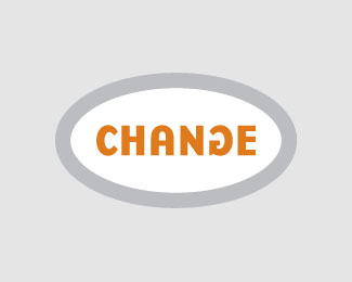
Float
(Floaters:
20 )
Description:
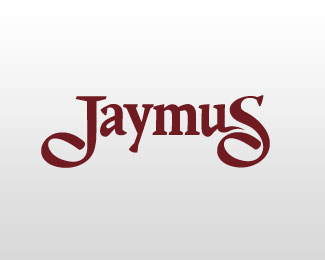
Logo for small marketing firm
Status:
Unused proposal
Viewed:
3710
Share:


Lets Discuss
loving the G concept
ReplyThanks!
ReplyYeah, very clever. :)
ReplyCHANGE is good...and this IS clever. nice.
Replyyeah, i'm glad the right one was gallerized. congrats man. this one was executed better.
ReplyJ U S T I C E !
ReplyYou're right, justice is sweet.
ReplyWasn%60t same/similar logo already in the gallery recently? What happened, jaymus?
Reply%5E I was wondering the same
Reply%5E The was a logo a similar to this (by a different user), was uploaded a few months after this one %26 was put in the gallery. Eventually the original was brought to the attention of admin %26 then the swap was made.
ReplyThanks for clarifying. We%60ve all witnessed here a rip offs many times, but knowing personally guy who created the 2nd Change logo, i%60m positive this wasn%60t intentionally. I mean c%60mon.. this is a cool %60logo%60, but the idea is so basic and simple that could happen to anyone. I%60m saying all this cuz i can%60t access to the profile of that guy, so it seems he%60s been banned/deleted cuz of this? http://logopond.com/members/profile/showcase/8696
ReplyIt appears that profile has been removed. I do agree that as far as 'inspired v. borrowed' goes this case could be just coincidence, I think it's a hard call given that it's just type...you know, start comparing letterform for letterform, kern for kern. Rules are rules though, probably wouldn't have been an issue if the 2nd logo hadn't received gallery treatment.
ReplyThis is the logo that was in the gallery http://screencast.com/t/PjHvQ9AM IMHO, this can%60t be called a blatant rip off, cuz.. again, it%60s just a font and an extremely simple idea that involves flipping one letter. Removing the whole profile of the guy who%60s been around for quite a while, who has won some Wolda awards, been published in numerous logo design books, etc.. and especially without even upfront warning, is ridiculous, to say the least. I hope i%60m not being subjective and alone here?
ReplyTo clarify, it wasn't just my logo. The admin and several users found multiple instances of blatant plagiarism of previously posted logos on logopond. The case for stealing ideas was fairly obvious, and so he was removed.
ReplyThanks, jaymus. I%60ve informed him about this and hopefully, he%60ll be able to come here and clear things up.
ReplyThanks, David.
Reply@ wizemark*This wasnt the only logo that user ripped off, on one of his logos someone posted like 5 links to logos he completely ripped off, he/she was a scam.
Replysmart touch :)
ReplyI had to create a new profile so I can say something too. I am very disappointed with accusations that I’m scam. After many years of creative investment in my logopond profile and modest influence in raising the quality of site content I have experienced my profile deleting without no warning at all.*I would never in my life steal someone's idea and I am the first to teach people not to do so. As an award-winning designer I always fight for respects of copyright because in my life I’ve already had the similar problems and had to seek legal assistance. Before I got idea for Change logo, I made research and haven’t found anywhere that someone before me had exactly the same idea. You can type ȁCchangeȁD in logopond %22search%22 engine, or in Google, there is no similar idea at all. I was surprised that I was the first to got the idea, and when my logo appeared in gallery everyone congratulated me, and noone warned me about similar logo on this page which I haven’t seen in my life before. If I saw this logo I would immediately react and remove mine. Also, it’s not true that 5 of my logos are rip-offs. Maybe 2 had the same idea which I didn’t know that someone got before me (Sharks and CyberTheatre), but others have completely different concept, and I would never gave up on copyright for those logos (logos with ȁCeȁD concept and twitter bird). Noone reacted when my Box logo has riped-off from someone else here in Logopond and had the same look. I would never risked to be accused unjustly for 2, 3 logos (from more than 200 which I got in my gallery) that are suspicious to others, for which I claim that were my ideas, but probably at the same time as someone else created, If only someone warned me about what is going to happen to me. I’m very disapponted and sad, specially with reactions of some people here. The only thing that left to me is to continue to work hard and fair as I always did in my life before.*
ReplyPlease login/signup to make a comment, registration is easy