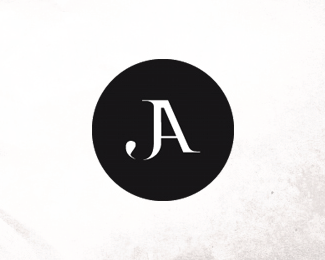
Description:
After much thinking about it and input from a bunch of friends and colleagues, i decided to go back to my old monogram with a few adjustment and kept the enclosure. this is the final and last time updating my personal logo, its somewhat of a pain in the ars to create your personal id :)
Status:
Client work
Viewed:
4274
Share:



Lets Discuss
I agree, I've been struggling with my own logo for months now. Way too many to pick from. I like this one. Simple style, but very strong. Did you have to tweak the letter 'A' a lot? Or is this part of a certain font?
ReplyYeah its quite a process, i tweaked almost all parts of it the only original part of it is the diagonal stroke of the %22A%22 the rest is pretty much custom.
ReplyPlease login/signup to make a comment, registration is easy