Description:
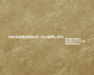
Executive Search company logo.
As seen on:
My blog
Status:
Client work
Viewed:
2922
Share:



Lets Discuss
Love it Jan! I think you need to close the space between the E and K at the end of each name. Sweet!
ReplyWow, very nice!
ReplyLoved the font! nicely done!
ReplyGreat looking type Jan! Love the 'A' accent.
ReplyThanks guys for leaving your comments, I want just ask have anyone problem read %22R%22s properly or it is too much %22K%22? in first name Reinberger ... Basic idea of this logotype is that 2 R%B4s and 2 K%B4s are same letter just rotated upside down, is it clear? Mark which makes RK and its not uploaded yet looks very fine, too and I personaly see potential in this logotype. Thank you for looking. **@ Joe, ur right about kerning, I will fix that, thanks for notice
ReplyAlen u got me :-D I totally missed that, will try it now, but I am not sure if it wil not destroy symmetry between first and last letter in each of the names ... thanks, good point, good eyes ...
Reply@ Mister Alen thanks, updated :-)
ReplyI will leave it now for night, we will see at morning. Looks good in applications and fits scope of business (top management, big global enterprises). We will see, thanks for care ...
ReplyVery nice!!
ReplyReally awesome work, Jan :)
ReplyWonderful.
Reply@Java @Breno @Mads thank you very much guys ... Logo was approved by a client and I am doing whole identity set now.
ReplyCongratz, Jan!
ReplyGreat typo Jan!
Reply@Radek ... diky pane kolego
ReplyDobry den, pikne typo Jan.
Reply@Milosz - dziękuję bardzo. I will add link to whole ID set, soon.
Reply@Milosz - dziekuje bardzo. I will add link to whole ID set, soon.
ReplyPlease login/signup to make a comment, registration is easy