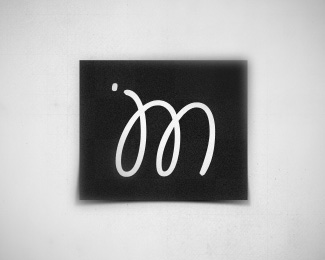
JM Logo
by janmense • Uploaded: May. 23 '12

Float
(Floaters:
1 )
Description:
new personal logo
Status:
Work in progress
Viewed:
4260
Tags:
m
•
j
•
logo
Share:


Lets Discuss
logo for me (Jan Mense)
Replywhat do you think?
very 'hipster branded' http://hipsterbranding.tumblr.com/
ReplyWhen I first saw it, I tried to read the four icons as a sentence but it didn't work out: J pencil/draws sees M. I would probably rearrange those elements so that JM is obviously paired and it's clear that the other two icons aren't part of the name. Also, there's tons and tone of retail space in that hexagon.
ReplySo she should fill in the white space? hehe
ReplyI like this. It's just pleasant. Most people wouldn't try to read the icons as a sentence.
Please login/signup to make a comment, registration is easy