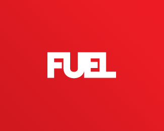
Description:
Brand for my design studio. Wanted a solid, type based logo that'd work on the web, in colour and b&w. Adjusted the centre bar on the E, just a touch.
As seen on:
www.fuel-creative.co.uk
Status:
Client work
Viewed:
1523
Share:




Lets Discuss
IMO, the gap between F %26 U can be a bit further like E %26 L. :) cos it seem too close
ReplyPlease login/signup to make a comment, registration is easy