Description:
Promoting digital social networking and civic journalism in deprived communities in Southern Africa.
Status:
Nothing set
Viewed:
12650
Share:


Lets Discuss
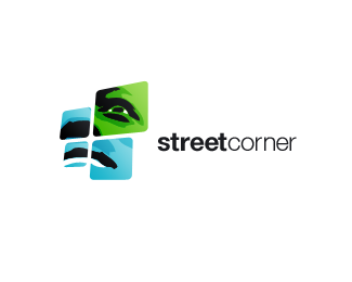
am liking this a lot although feel the type and the graphic seem slightly divorced
ReplyI love the typace. Is that Helvetica?
ReplyI think it's Helvetica/Swiss or some derivative...
ReplyThis is really neat looking.
Replywow
Replyso captivating so strong
ReplyWow...love the powerful statement of this.
Replyjust like the logogram....:)
ReplyLove it when a logo can tell a story and transport you places, this one does it for me, I also like the fact that logos like this one have a second chance to make it into the gallery months or years later.
ReplyVery nice! But, IMO the kerning needs a little work. The space between the R and the N (corner) is bigger than the other characters. The E seems smashed.
ReplyReally cool work!
Replythis is very impressive. that facial expression says a lot. logotype is a perfect choice and compliments it well.
Replythis has such presence. Excellent
ReplyFresh, fresh, fresh!
Replywow!! It really grabs your attention.Definitely a fav :)
ReplyVery different from others!!
Replylove the approach, the color and the concept. :)
Replygreat mood!
Replyso amazing!
Replyincredibly fresh.
ReplyPlease login/signup to make a comment, registration is easy