Description:
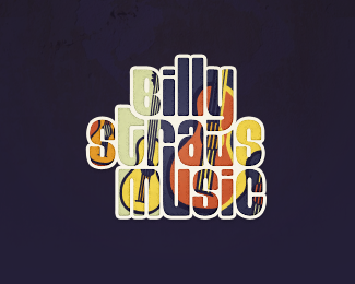
Combination collage + mosaic + cutout.
As seen on:
billystrausmusic.com
Status:
Client work
Viewed:
1914
Share:


Lets Discuss
I like the concept and the workout, but its not easy to read. I'm not sure, if its possible, but you maybe should try to alter the colors to have all a good contrast to the white outline.**The word 'music' could also have some 'runaway'-letters (like the 'll's on Billy), being shorter or longer so the break of the flat baseline. Just as idea.
Replytx watermarker. Yes, a clean, white version of this was the starting point, but it ultimately developed into a standalone design element geared for the website. This is a reduced format of that...I'm sorta cheating here.
ReplyPlease login/signup to make a comment, registration is easy