Description:
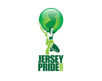
This logo was done for a young client who has taken it upon himself to raise the perceived status of the state of New Jersey.
We thought it would be nice to reference ATLAS – referencing his support of Jersey, and identifying his site as a place to learn about the world of New Jersey.
Status:
Client work
Viewed:
2537
Share:


Lets Discuss
It reminds me the azko nobel logo. But it's really well done.
ReplyReddskinn, it has a lot of similarities in style –%A0I agree 100%25. I saw a great video of the evolution of that logo, and will not say I was not influenced! Bald men ftw on this one!
ReplyI'm interested in this logo, can you get back to me with some design changes i would need with the colour?
ReplyWe are trying to decide on a logo design and I'd like to submit this as a possibility.
BTW my email address is mystery @ live.ca
ReplyPlease login/signup to make a comment, registration is easy