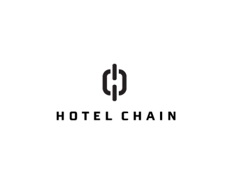
Description:
Concept idea, this was a by product of my idea sketching for a proper hotel identity project I am working on. Playing with Negative space and a small play on words. Forming the 'H' from the negative space made from the chain.
Using Armada font from Font Bureau due to the similarity in shape with some of the characters such as the 'O'.
As seen on:
Status:
Just for fun
Viewed:
6355
Share:



Lets Discuss
Very clever concept.
ReplyCould be a little smaller, but I like it.
Reply%5E agree with Joe on the smaller showing. great concept though. very nice.
ReplySmaller as in smaller icon? :)
Replyjust make the whole logo smaller, and it'll be great!
Replyclever but not really feeling a %22hotel chain%22. This does not seem to fit the industry yet as designed IMO.
ReplyLogomotive : Agreed its doesn't fit hotel industry, and is pretty random. But it wasn't intended to align itself in this way. It's just a concept for fun, playing on the phrase and focusing more on the 'chain' and fitting in the initial 'h'. :)
Reply:) ok cool combo though. Good luck with your other one.
ReplyLogomotive : Frankly, any 'h' word would of done and probably would of been better in hindsight than something as specific as hotel. But as I was working on a hotel logo, it was top most in my mind. May change the word to something more 'random'. :)
Replyit's just creative (: good one!
ReplyFrom an idea standpoint %3E brilliant! :)
ReplyMichael : Appreciate the words coming from you... :) It really was an accidental idea, would of been nice to have been able to create more meaning as Logomotive pointed out, but then it's just me playing... :)
ReplyIt's not so easy when dealing with clients, but you could change the first word so the logo could fit in a different industry. Perhaps, %22Heavy Chain%22 or something else that makes sense. Clever concept though.
Replyclever again :)
ReplyThis is amazing!!
ReplyPlease login/signup to make a comment, registration is easy