Wavepulse Acoustics
by imjustcreative • Uploaded: Mar. 07 '10

Float
(Floaters:
11 )
Description:
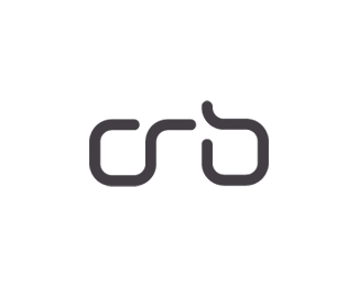
A logo for a company that design and build custom loudspeakers for PA systems, musical instruments, touring rigs, sound reinforcement, DJ's and the like.
Using Amplitude typeface from Font Bureau which provides a slight 'rawness' to the logotype which is a perfect association.
It was crucial for me to avoid any cliche and tacky waveform, speaker imagery. So finding a less immediately obvious solution needed to be worked on.
We first have a white line which acts as a visual reference to 'wave form', that's the first association. The fun bit is that we have all 3 initials formed from this waveform.
The 'w' is the central focus, obviously raises higher in the middle. There is a angular slightly skewed 'p' in the middle, which is not quite complete, but the association is there. The p link is not strong, which is fine as 'pulse' is sewn together with wave as one word.
Finally we have the capital 'A' also formed from the middle of the 'w', the horizontal line that runs right to left creates a shape that needs looking at rather than being perfectly symmetrical. Adds some visual curiosity.
As seen on:
Status:
Client work
Viewed:
4316
Share:


Lets Discuss
This has a very nice feel and look to it. Nice work.
Replyagree wid joe
ReplyPlease login/signup to make a comment, registration is easy