Description:
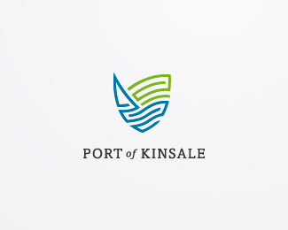
Kinsale is a popular holiday resort in Ireland known for its leisure activities - including yachting, sea angling, and golf. Logo was made for the group of hotels and restaurants located in the beautiful Port of Kinsale, in the middle of the sea and large green grass golf terrains above them. The aim was to promote tourism and attract more irish and foreign tourists to Kinsale.
Status:
Unused proposal
Viewed:
12458
Share:


Lets Discuss
nice mark
ReplyThanks Deividas.*I didn't mention in the description that Kinsale is surrounded with many old walls of forts and castles that standed there, and some of them still are and they are touristic attraction also.*They were also inspiration for this %22brick wall like, shield like%22 logomark.
Replyit's a nice logo, man. :)
Replythanks a lot Stellan
Replyi see shield also, realy nice :)
ReplyAndrej, nice mark you have there:)*Have you tried with different type?
ReplyYup mate. I tried several type options.*This, and one more made the best appearance in my opinion. I will reupload the other one for you to see if it is better option than this.
ReplyThanks Alen, waiting for yours to see...*@roko Here's type updated.*This one gives more place for a mark to come in the first plan, it's more subtle than the first one...
ReplyYep I like this layout more than the previous one.*I know I'm boring but you could also try to make the %22of%22 in lower case and italic. That would spice the type a bit:)
ReplyThats definitely worth exploring.*No, you're not boring - you're very constructive!
ReplyOne more time type updated based on rokos feedback.*Thanks roko works nice this way, athough I liked prev. vesion too...
Replyturned out great, i like it better this way.
Replythis looks much better, but maybe reduce litlle the mark.. just thinking :)
ReplyNice update Andrej, nice.*I'm with Deividas, reduce the size of the mark and maybe slightly increase the size of %22of%22:-)
Replyhuh guys you're giving me a hard time now...wait a little it's coming...
Replyupdated! better?
Reply%5E Yup
Replyperfect:)
ReplySweet. Definitely better.
Replyjust two lines and you have versatile logo with great aesthetic quality - students looking at this should make note in the power of simplicity**well done hyperborea
ReplyGreat! This is definitely one of my works that I'm emotionally connected with in a special way!
ReplyThanks raja I appreciate it!
ReplyAwesome work man!
Replylovely this
Reply@pierro, luiz*Thanks!
ReplyThis has a great feel to it.
ReplyRoko giving live coaching! lol. Very nice mark Andrej..im just indifferent about type. Not sure if san serif would be a better option... but none the less Its got a very inviting and strong feel as JoePrince says.
Replythanks Joe and thanks Riz!
Replyand this is a true logo! great mark
ReplyGlad to see this in the gallery. Once again nice work Andrej%3B)
ReplyReally great work! It aptly conveys Kinsale and overall what it essentially stands for.
ReplyPretty nice!
ReplySweet work!
ReplyThanks all. Sean you were there in Kinsale for real? seems like the great place based on my researches. I'm glad I nailed it if you say so. Chers!
ReplyNice mark - saw the shield right away. I've been to Kinsale, very quaint little town. The type looks good but did you try stacking it on two lines? It might help balance out things a bit and give your logo a nice vertical look. Just a thought.
ReplyI like it a lot. Thanks :)
ReplyGreat work!
ReplySolid logo...great work
Replyi like this very much. nicely done with the mark taking form of the shield. strong logo
ReplyDid you design the font yourself?
ReplyThank you all for floates!*@Ryan: No, the typeface is Amasis with a little bit of manually adjusted kerning.
ReplyI think this is quite interesting.
Replyvery cool and uniqe! I like the whole form which has a feel of a modern crest, very well executed
ReplyI love this logo, the colours, the mark, the type. Really nice design.
ReplyI was in Kinsale last week. You've absolutely captured this beautiful place in the mark. Well done.
ReplyI love the marriage of modern and classic. It sounds as though you successfully conveyed the essence of the resort. congrats!
ReplyThank you very much. Appreciate it.
ReplyGreat mark, I like the way you divided green and blue. Also for typography it would be much better if it was Port and Kinsale in small capse (not faux one), so that %22of%22 would fit perfectly.
Replybeuatiful !
ReplyTY Bernd!
ReplyWorth to mention that this one is published in Gareth Hardys %22Smashing Logo Design%22 book :) TY Gareth.
ReplyOpaaa cestitke :)
ReplyHvala Jovane!
ReplyPlease login/signup to make a comment, registration is easy